Logical Imagination Logo Re-design
My Final Submission
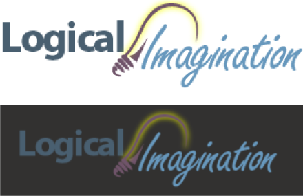
On the left, you can see the original logo created in 2004. On the right is my final version.
What was the prompt?
Logical Imagination is working on updating their brand and asked for design submissions for their logo. The logo had to show two sides of the business: the logical, analytical and programming side as well as the creative, design thinking side. Colors used also had to showcase a feeling of trust and vibrancy.
My thought process
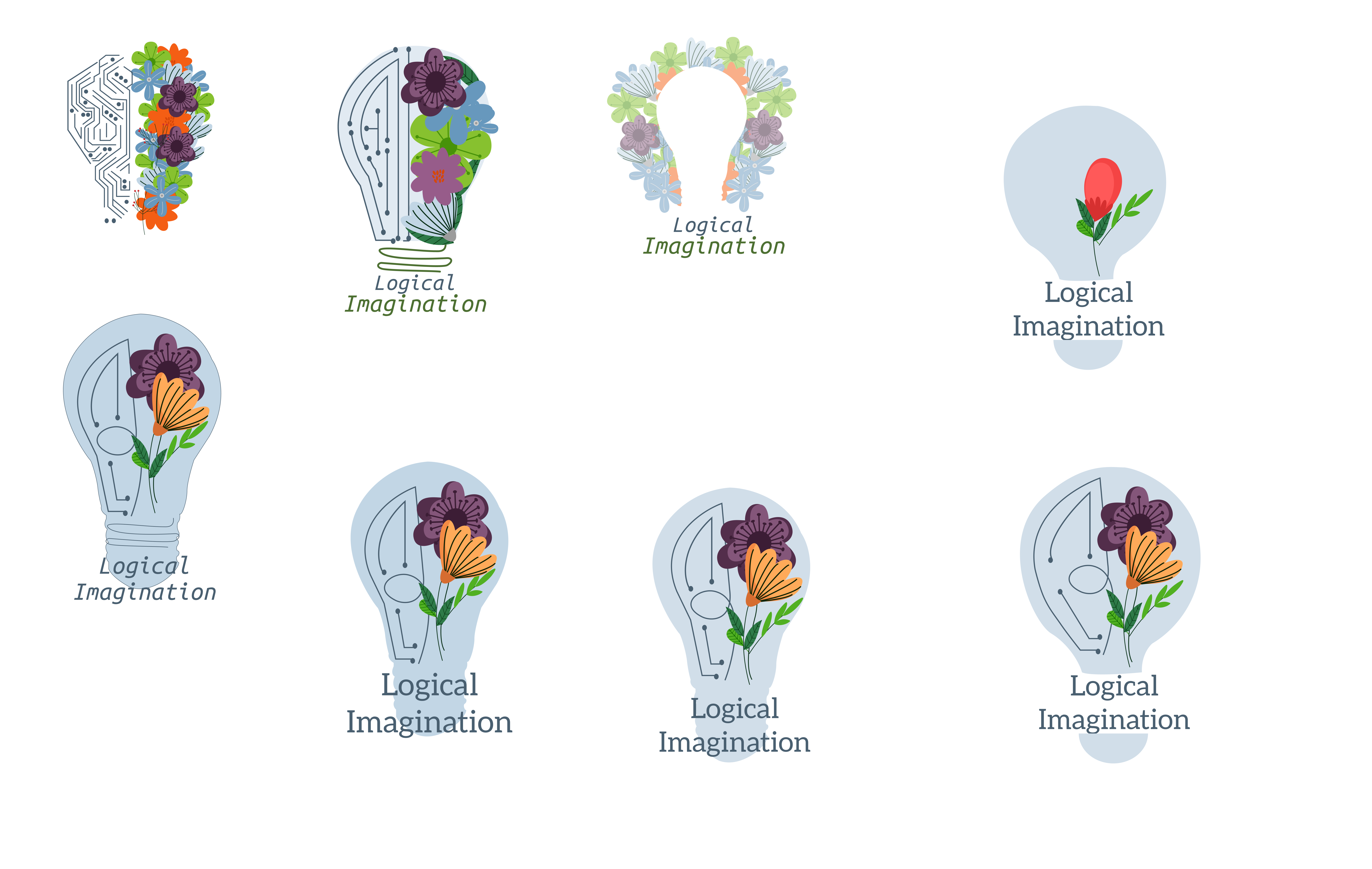
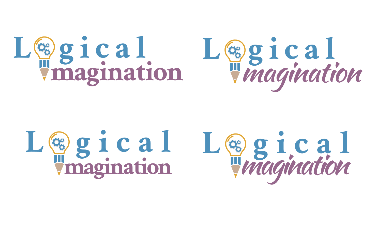
See below for all my initial design ideas.
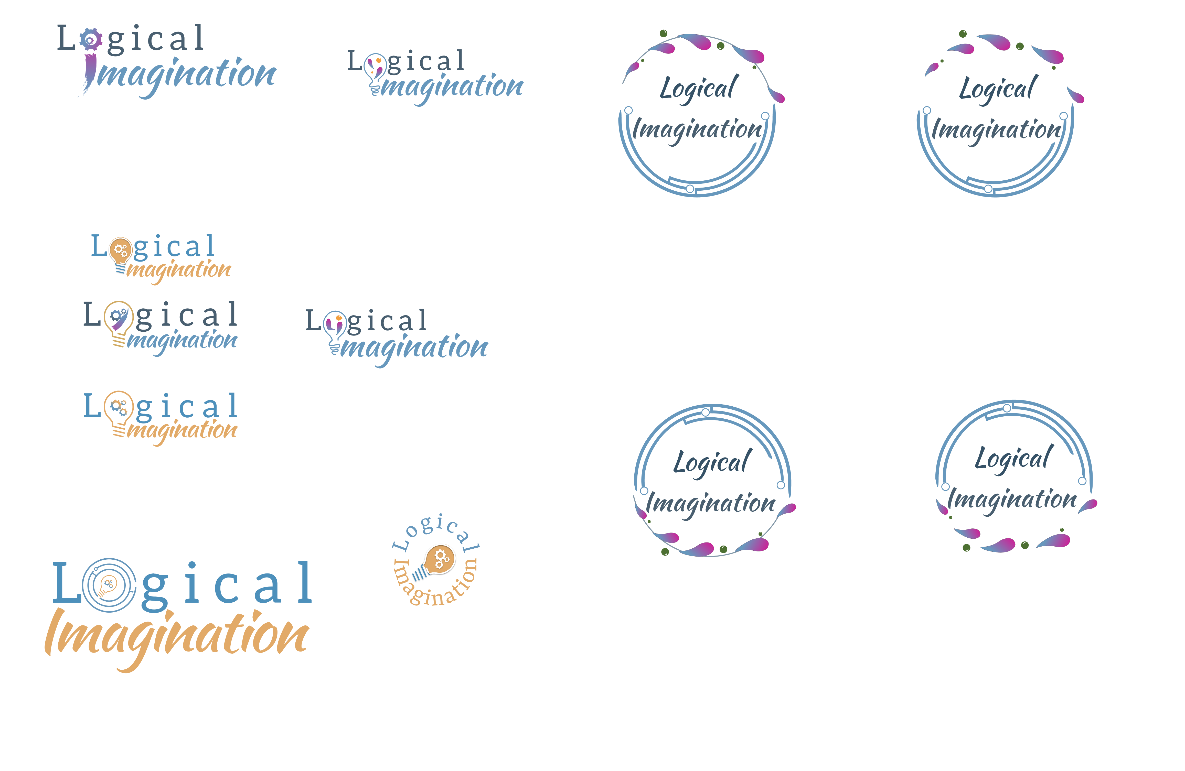
I used the colors blue, purple, and orange to convey a feeling of trust, creativity/wisdom, and vibrancy. In my earlier designs, I used circuit boards and flowers inside a lightbulb to showcase technology, vibrancy, and creativity. However, I learned through some user testing that people felt it was too busy and complex.
I continued to re-design, ultimately returning to the logo of having the full "Logical Imagination" name and a lightbulb, but integrating the lightbulb into the actual name (the lightbulb forms the "O" of "Logical" and the "I" of "Imagination").
With my last design, I changed the bottom of the lightbulb to a pencil to add more imagery of creativity.
My designing journey- all versions
